Alebrije Mezcal
Alebrije Mezcal is a fictional liquor company inspired by Alebrije figurines made in Oaxaca. When developing the packaging label for their signature mezcal, the objective was to reflect the natural aspect of making mezcal and alebrijes. All mezcal comes from agave and all alebrijes are carved naturally by hand. I explored using several bold color combinations and the use of fantastical creatures to evoke the feeling of Alebrije figurines and the Oaxacan region. The final design uses a snake design and a bold colorful type treatment.

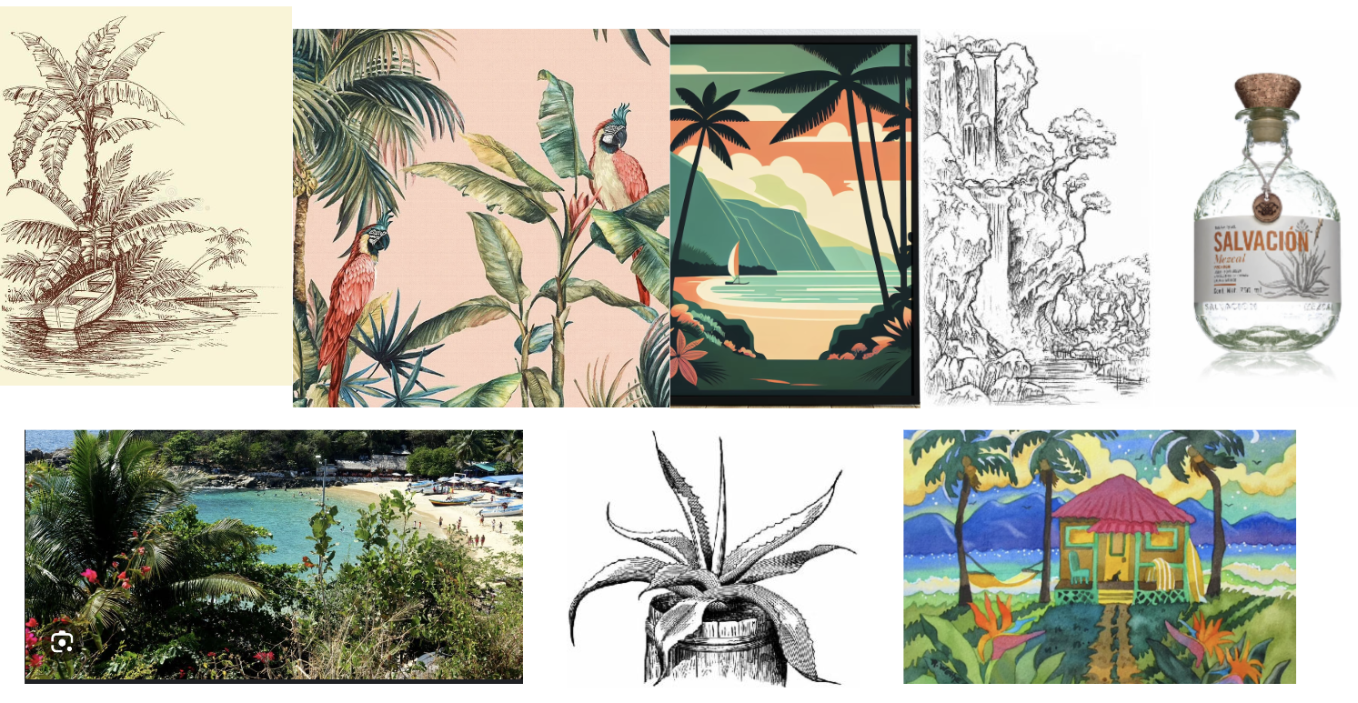
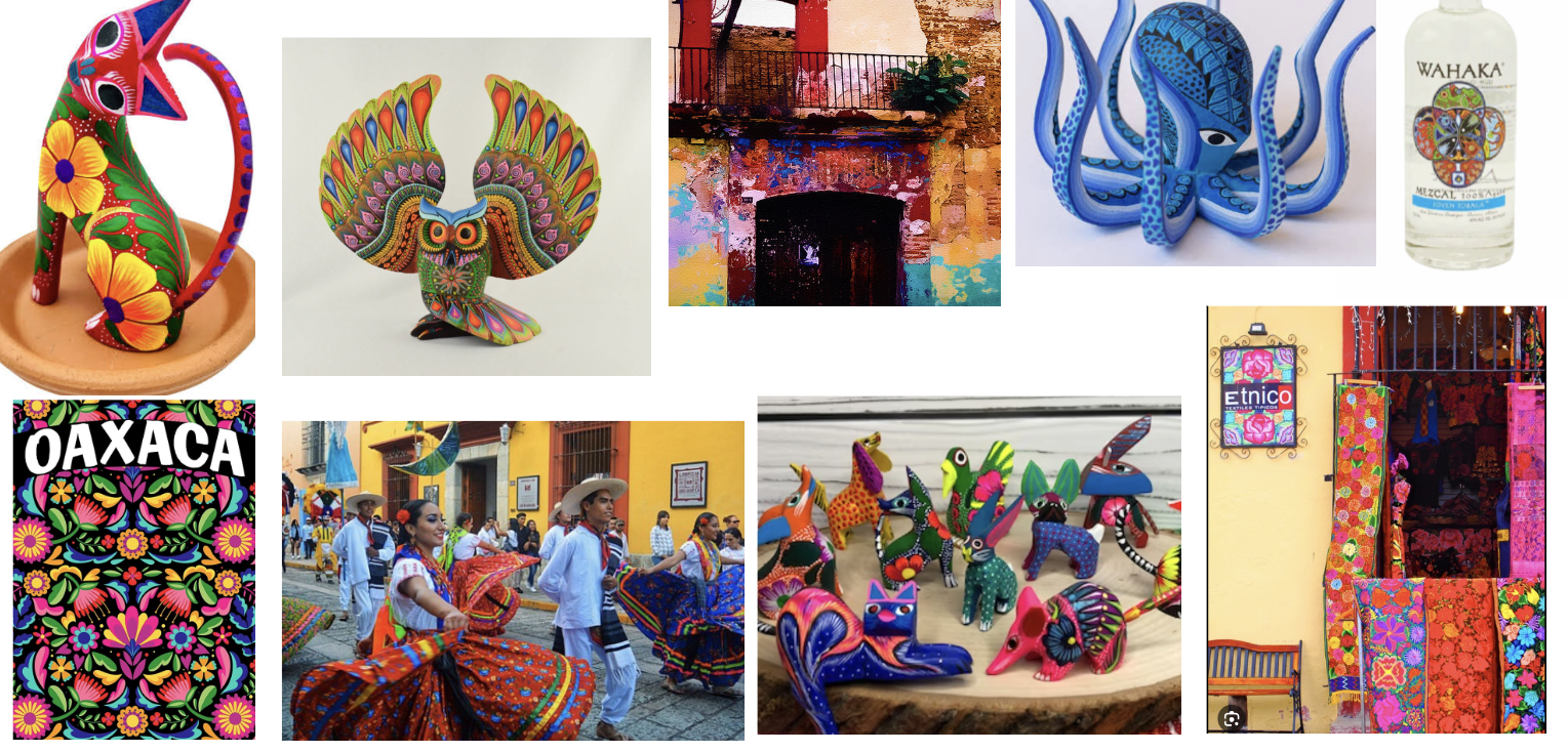
Mood board used to emphasize the natural aspect of making mezcal and alebrijes. All mezcal comes from agave and all alebrijes are carved naturally by hand.
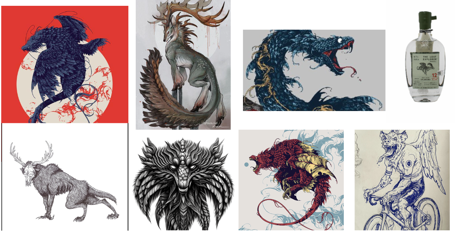
Mood board used to show the fantastical creatures that alebrije figures are based off of; usually a mix of two or three creatures.
Mood board for the importance of color when creating alebrije figures. All alebrije figures portray multiple vibrant colors or color shades to give off a fantastical feeling
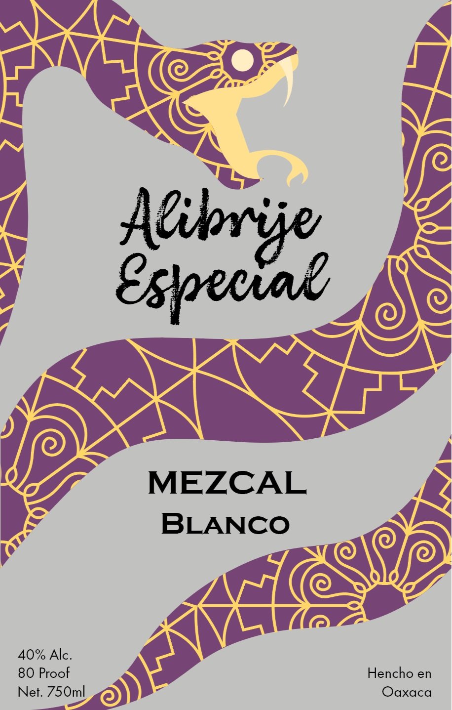
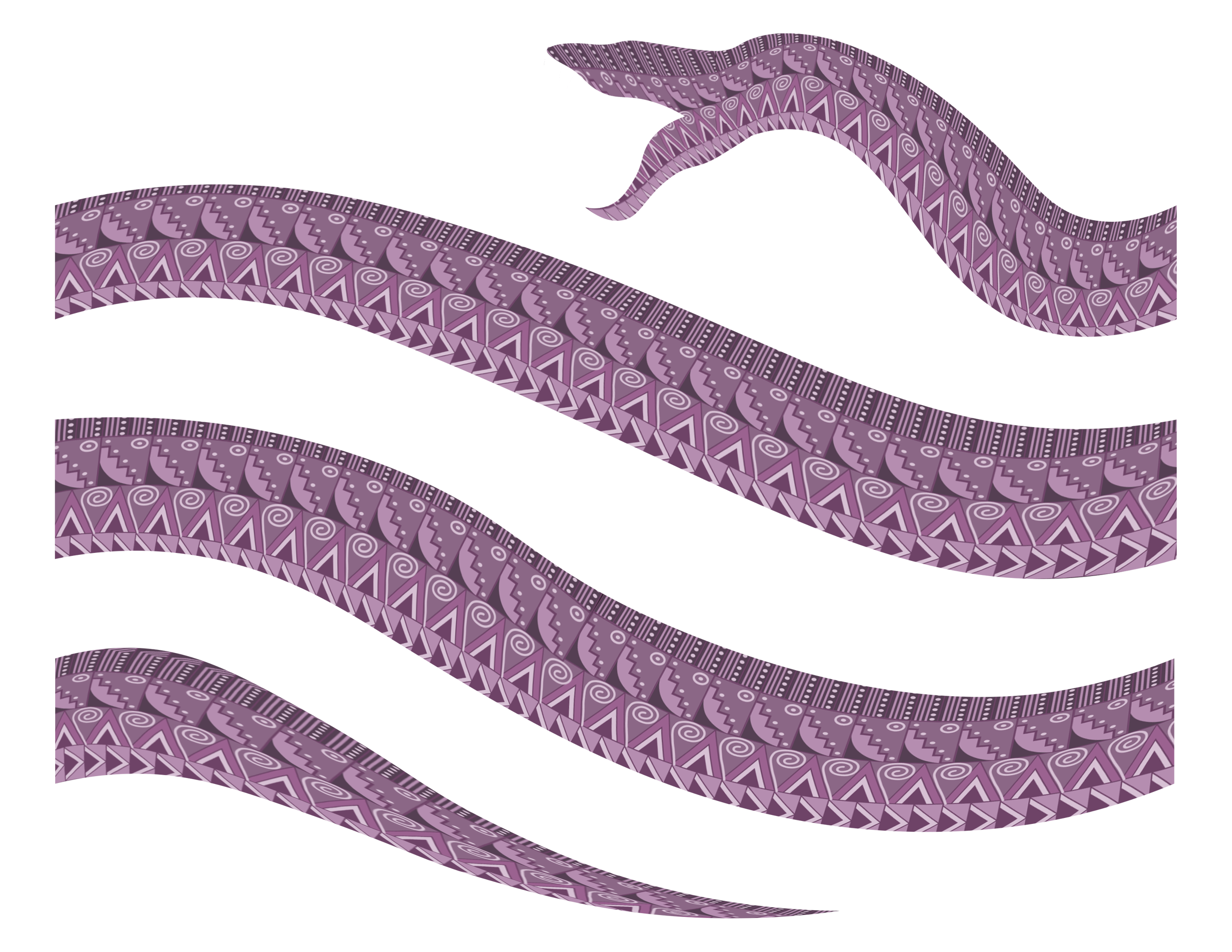
Initial Drafts
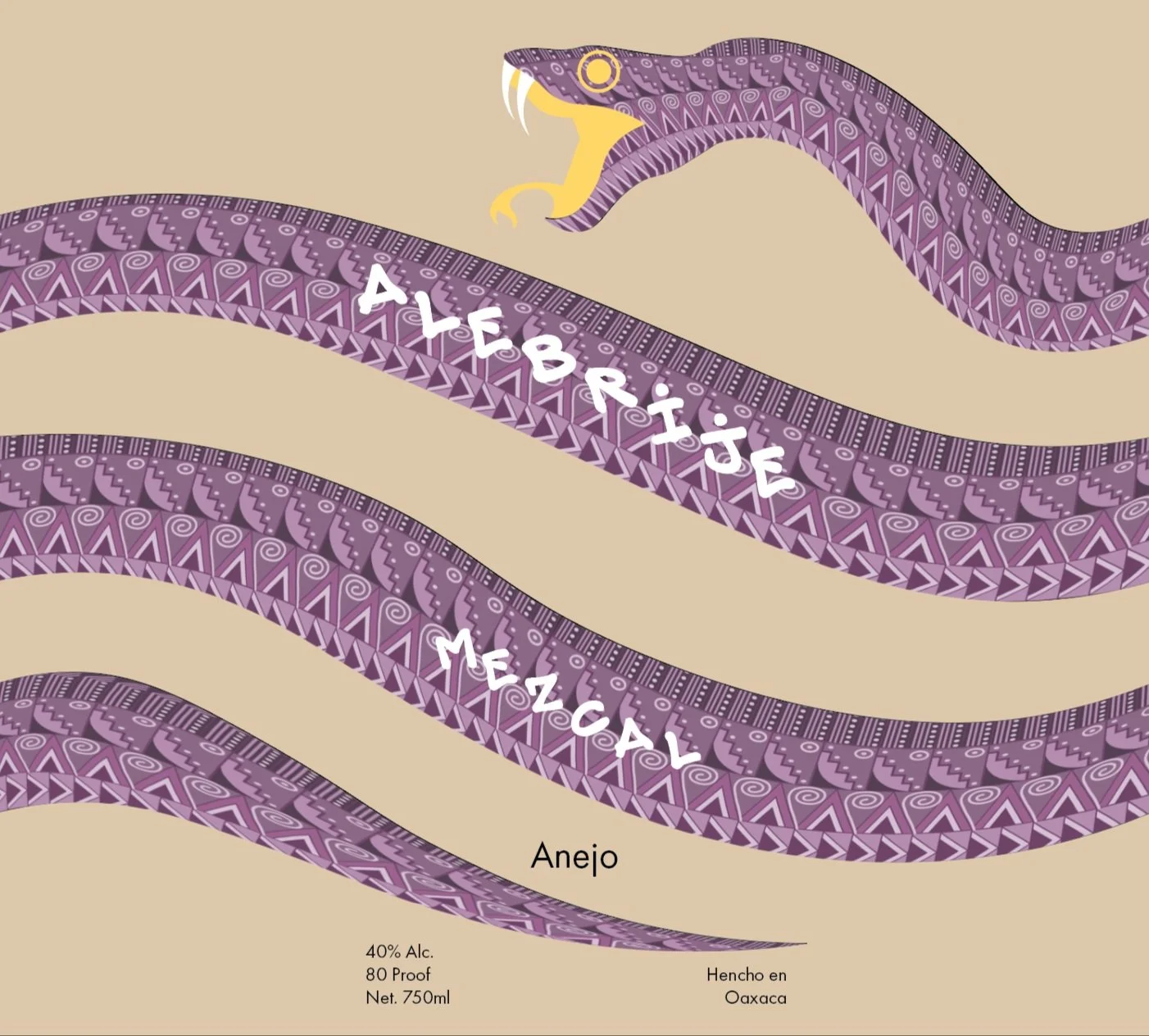
Initial designs looked like the drafts on the left. At first I was trying to portray a sort of alebrije type animal facing the label like the bottom example, but my professor was very interested in the snake design so I decided to make an alebrije style pattern and shape it like a snake.
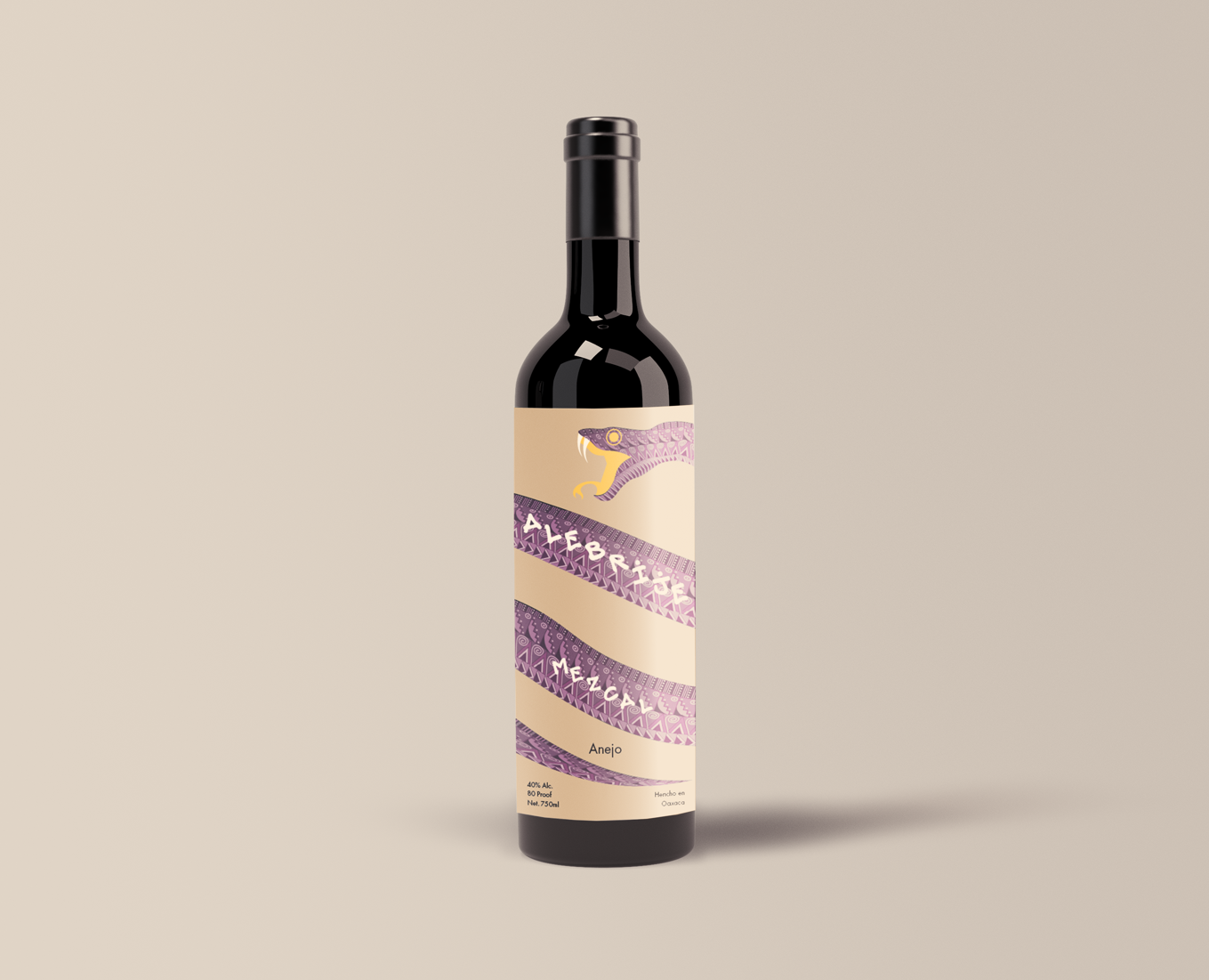
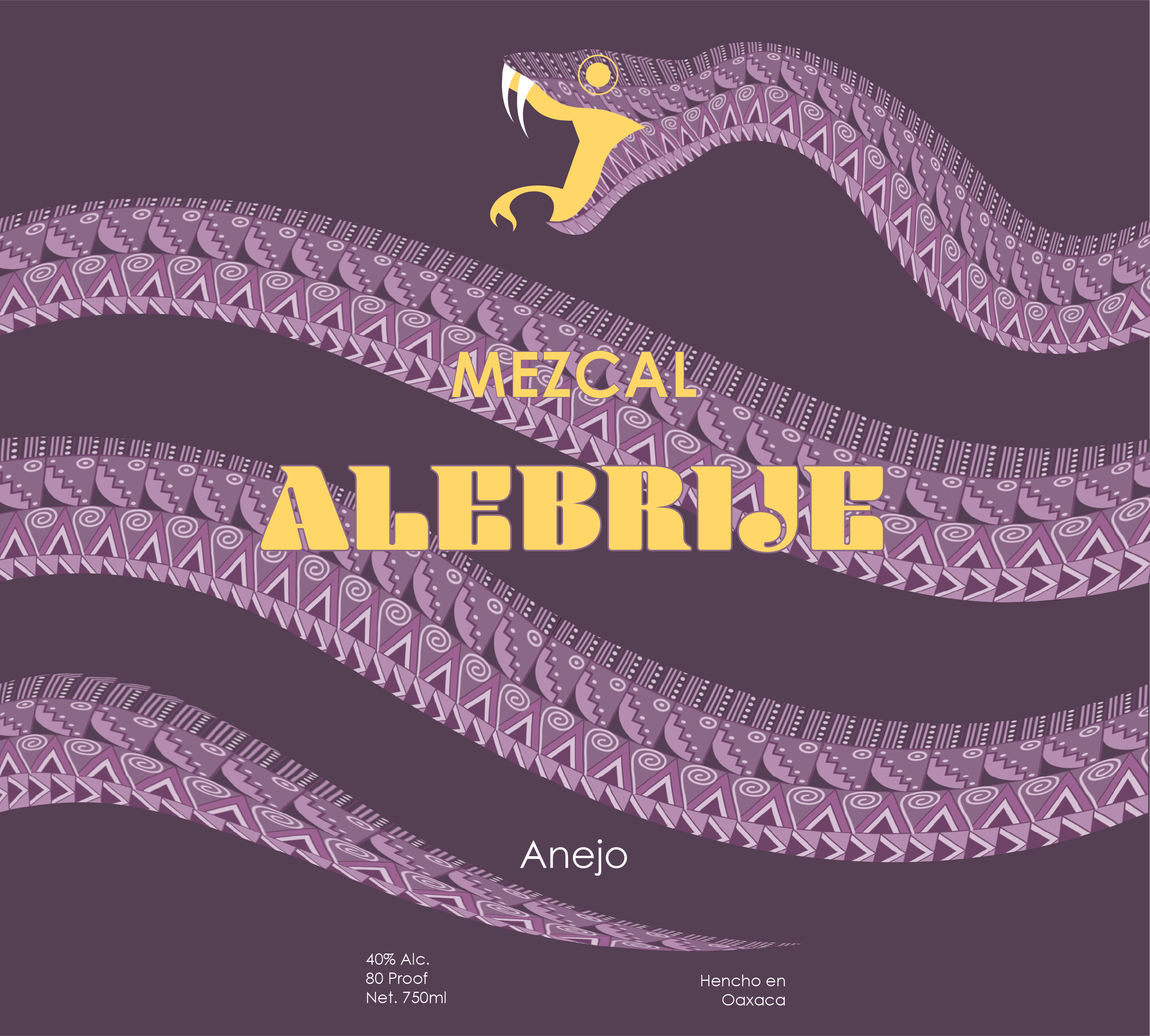
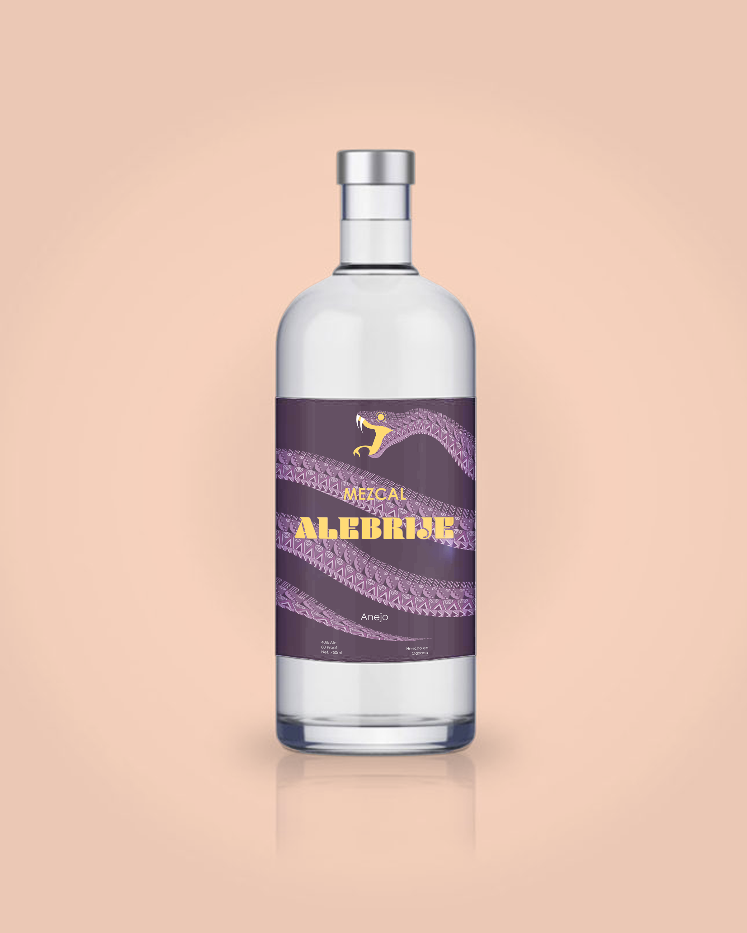
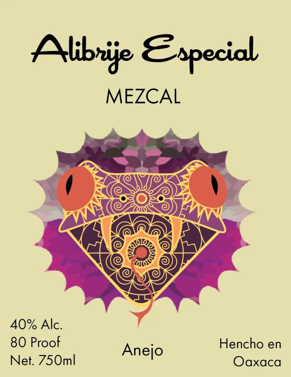
final Drafts
Semi-final draft is to the left while the final label is below. I had trouble making the display font work on top of the snake. At first I tried to align the type with the snakes body, but my peers believed it would be too hard to read so I ended up using the bottom version with a very bold heading that can still be read over a very detailed background.